IMAGE 1
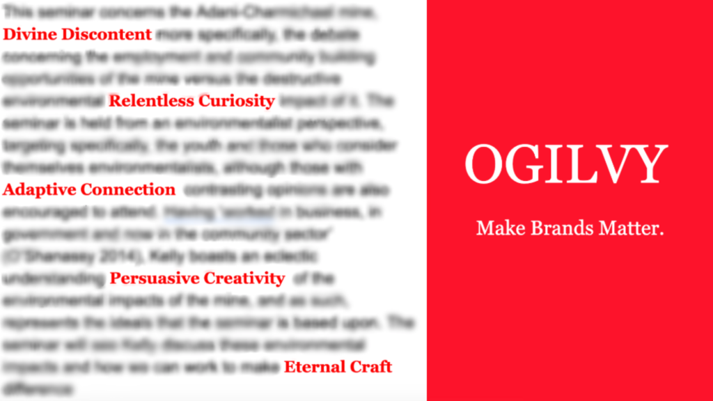
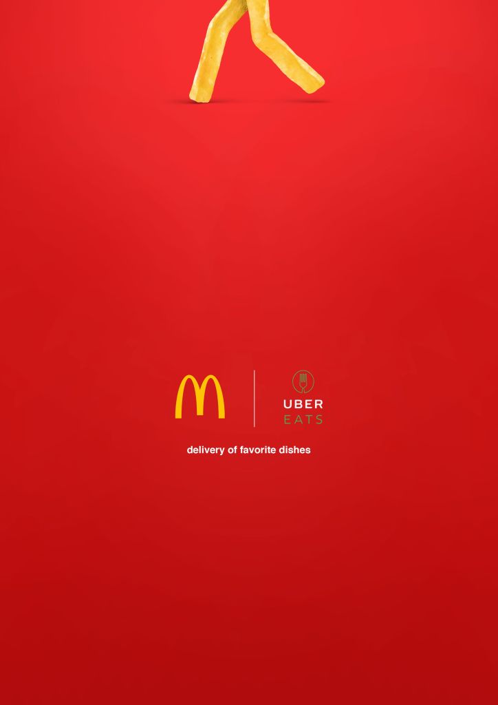
The organisation I have chosen to base my set of images on is Ogilvy. Ogilvy is a New York City-based British advertising, marketing, and public relations agency that has frequently utilised digital media technologies to boost online client organisations’ online presence, showing an understanding of the importance of digital media technologies in achieving success in the contemporary, online space. I intend on creating a simple and minimalistic yet effective campaign, resemblant of a variety of Coca-cola and McDonalds campaigns (see below), producing images that experiment with both physical photography and digital manipulation. As such, my image is intentionally simple and minimalistic, largely inspired by the organisation itself, as I have made sure to keep the image aligned with the colour scheme of the organisation, red and white, as well as explicitly reference both the slogan and key values of the organisation. All of which are brought to the forefront of the image due to its minimal nature.
From a compositional standpoint, the image follows the rule of thirds, with the salient component of the image being the right third, with the vibrant red and large white font displaying the Ogilvy logo, which is the given of the image. Although, it should be noted that this isn’t the exact logo of the organisation. This was to avoid copyright issues. Additionally, the red text on the left side of the image is the organisations values, as previously noted. These words are the ‘new’ of the image, positioned in such a way that they act as vectors that lead to the salient portion of the image. When synthesised together, this represents the ‘golden ratio’, allowing for more persuasive visual image.
To add, the image reflects the digital literacies concepts of real/manipulated, as I have used digital technologies to blend together real elements of Ogilvy, (the values in the text) and the manipulated logo and blur. Moreover, I am working on synthesising the old/new concept within my images more clearly. This is because Ogilvy is a leading organisation within the field of communications, in the sense that they frequently utilise new, digital communication streams and methods within their campaigns, as opposed to their competitors, who are still very much using traditional media channels. In future weeks, I will try to refine the details of, in particular, the manipulated elements of my image, as well as work towards the clarity of illustration in regards to the concepts of digital literacies, as I feel as though this can be drastically improved upon.
IMAGE 2
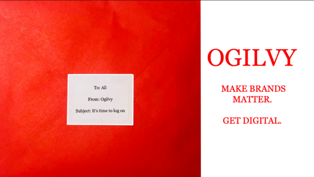
My second image is focused, more so than my first, on illustrating the digital literacies concept of ‘old/new’. Maintaining the minimalistic and simple design choice, as well as continuing with the Ogilvy red-white colour scheme, the image is my first attempt at implementing real-life photography in my campaign. The image features a red envelope, representing an ‘old’ means of communication, with the text on top, in the format of an email, representing a ‘new’ means of communication. The image serves as Ogilvy’s calling to all competitors that there needn’t be such a reliance on traditional or ‘old’ media as a means of promoting a brand.
Compositionally, this image shared a lot in common with my first one. This is intentional as I want to maintain a common aesthetic and general coherence for the campaign. This image, as well as my first one, is linear, in the sense that the eye moves and receives information horizontally. This ‘constitutes a progression’ (Kress & Leeuween 1996, p. 219), from the given to the new. This image also follows the rule of thirds, with the given of the image being the ‘Ogilvy’ logo (also not the actual logo to avoid copyright issues) in the right third of the image and the letter and message being that of the new. The letter also acts as the salient portion of the image, with the lines of the envelope, whilst subtle, acting as vectors that draw the eye into the text. This image, when considered in its totality, also represents the golden ratio.
In future iterations of the image I want to work on bringing the vectors of the envelope out more, and fixing some of the lighting and editing issues to improve the effectiveness of the image.
IMAGE 3

My third image is most certainly my most experimental out of the three. Whilst still designed with the Ogilvy colour scheme, it is by far the most minimalistic, and is heavily inspired by the McDonalds advertisement shown above. The image is also based on the idea that ‘where a viewer of a more cluttered ad might spend a fraction of a second on each element, the viewer of a minimalist ad spends the entire time focused on the single message, often a logo and tagline’ (Dontigney 2019, p. 1). With this in mind, I wanted to create an ad that was thought provoking, and, in its totality, perpetuated a single message in that of Ogilvy’s ‘pro-digital’ stance.
The image abandons the trend of linear, horizontal composition that precedes it in image one and two, instead, adopting a non-linear, vertical composition, utilising what is referred to by Kress & Leeuween (1996), as ‘information value’. They outline ‘information value’ as, ‘the placement of elements endowing them with specific informational values attached to the various zones of the image’ (Kress & Leeuween 1996, p. 181). As such, the salient, messy text reading ‘Ogilvy’, placed in the upper middle of the image, is a visual means of conveying the notion of ‘keep it tidy’, which is reinforced in the slogan below
It is crucial that this message is conveyed through this visual cue, as there is an intentional lack of vectors and other compositional elements such as text or alternate imagery to directly state the message of the image. Although, through Pixlr, I tried to emulate the ‘Aiden’ font in the Ogilvy logo, to ‘bring with it its own meaning’ (Hall 1999, p. 274), whilst also adding slight shading to the image, giving it more depth, creating the most effective image that I could.
-
Algorithms: Democracy’s Biggest Hindrance – Week 5
Can algorithms be agonistic? If so, what effect does this have on democracy? Does this hurt the democratic process at all? To answer, we turn to Crawford (2016), who goes further in depth with this question. With the digitization of modern society, algorithms are becoming more and more potent within our daily lives, vastly influencing… Read more
-
Today’s Exclusive Normality – Week 4
‘Technology is a preoccupation of contemporary life. It provides ways of doing things, makes work, creates material goods and services, and defines ways of life’ (Goggin’s & Newell 2003, p. 3) What if everyone was in some way disabled? Would society be any different? Would this be considered normal? The answer is yes. Yes, society… Read more
-
Dissecting the Digital Divide – Week 3
In today’s digital world, the average individual would assume the internet as a staple in the lives of all, both a necessity and communally shared luxury. Although, is this really the case? Is the all encompassing digital space as inclusive as it may seem? To further understand this, we turn to some of the most… Read more
Follow My Blog
Get new content delivered directly to your inbox.

This is a solid start to the assignment. First glances, the image looks refined, of a high quality and very unique. I like how you have aligned the companies simple and minimalistic values as well as the company’s colour scheme with the creation of your image.
The use of bringing the important text into focus serves as an effective focal point and shows me where the important information is, and the use of the red colour scheme really sets it apart from the dull background.
For improvements, the right side of the image really overpowers the whole image and by dulling the colour red slightly I think a lot more attention will be brought to the left side of the image while still keeping the power of the right side. However, I do understand that by changing it will set it apart from most of Ogilvy’s images.
LikeLiked by 1 person
The use of colour contrasting and easy to read text really highlights the aims of your campaign, offering a clear yet succinct introduction to your page. This can be seen through how clearly your campaign relates to your chosen concept pair of old/new, through minimalistic designs and reference to ‘Ogilvy’ still being active on traditional media channels within your description of image 1. However, it could be useful to try link your images to this concept just a little bit further, maybe using further symbolism or more intense and obvious use of contrast. The theme of red and white is also very aesthetically pleasing whilst also adds to the credibility of your campaign due to it following the brand/colour trends and themes of ‘Ogilvy’. Overall you have delivered a great campaign so far, which is full of unique design and great dissection of your chosen concept pair.
LikeLike
Your campaign image looks amazing and it clearly emphasize the concept pair. The color contrast and framing of the image not only make the image give great aesthetic pleasure, but also draws the viewer’s attention at first time. The right side of the image constitutes the largest element of this picture and the focus make people know where is the important information.
Like Kress expressed, composition involves framing, through devices which connect or disconnect parts of the picture (Kress. G & Van Leeuwen. T, 182) To some extent, I think maybe you can strong framing through adding frame lines and discontinuities of color or shape. For example, you can add a black horizontal frame line between red and white and change the color of Ogilvy logo to black. Moreover, I think change the background color on right side of image to gradient will make the picture rich layering. Anyway, it is a really good picture, keep going and good luck.
LikeLike